Scope of work:
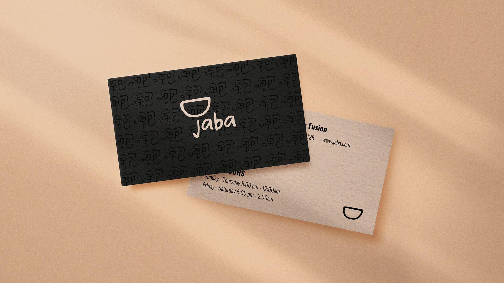
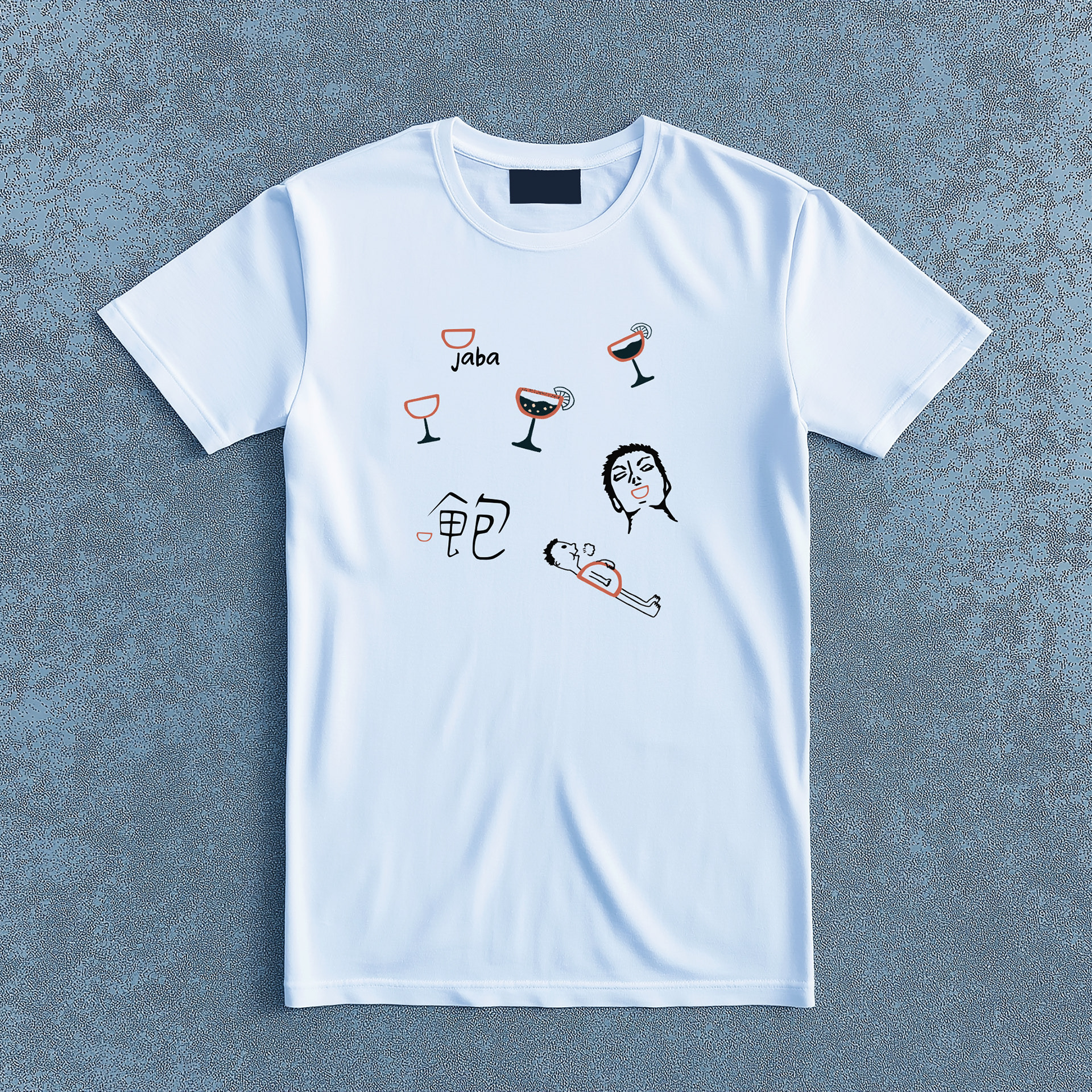
Visual identity, illustration, business card, posters, T-shirt
About jaba
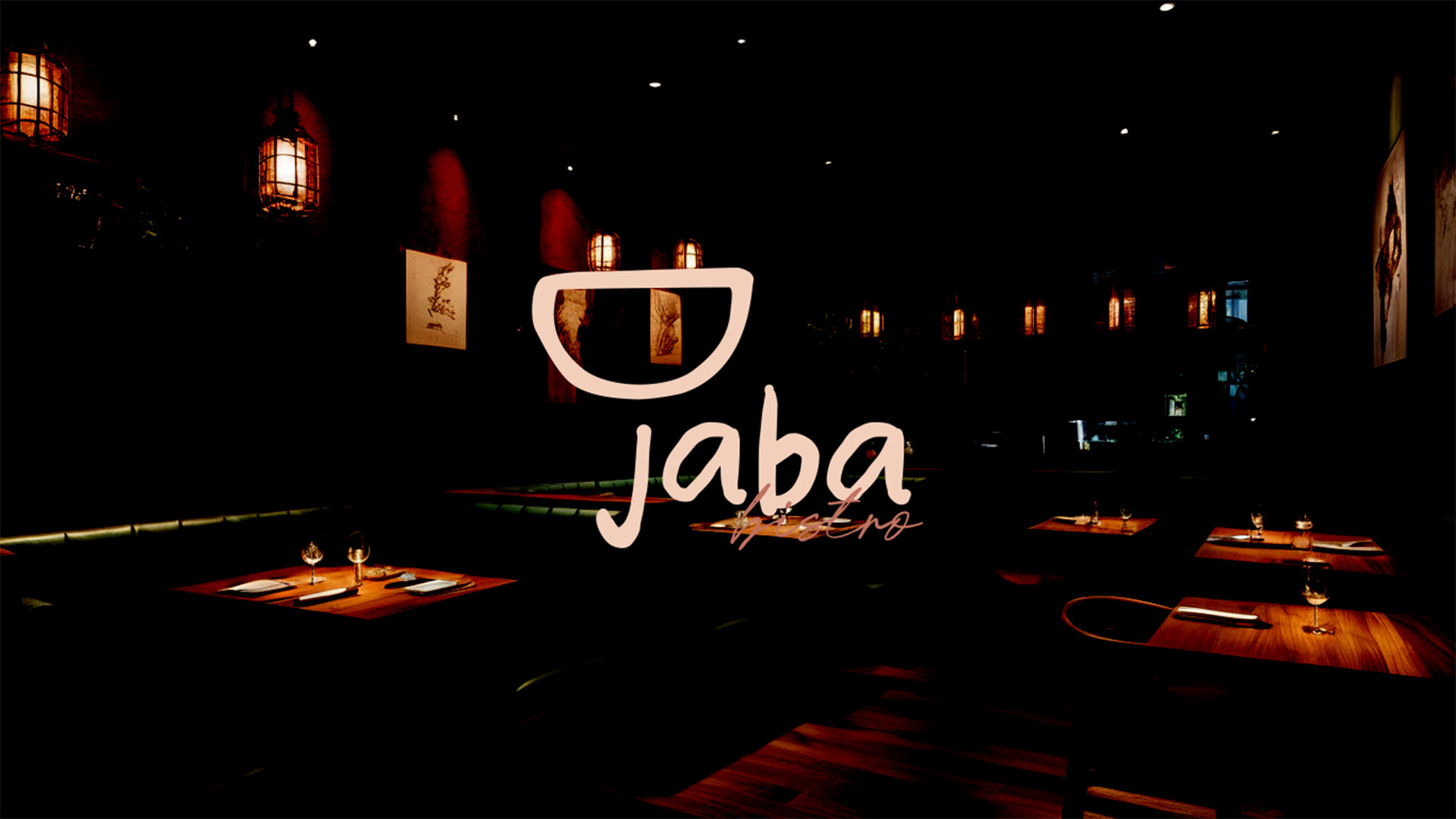
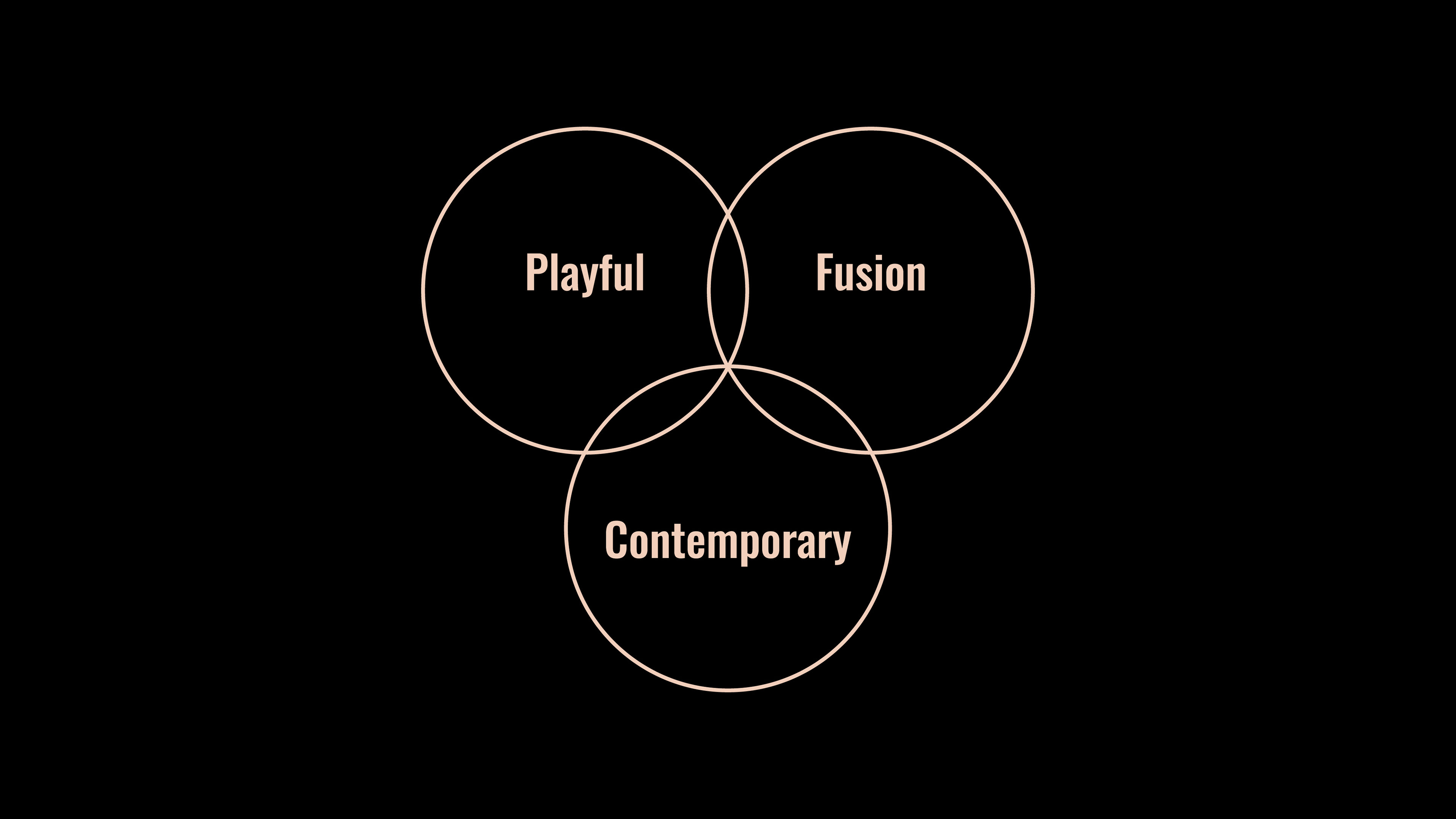
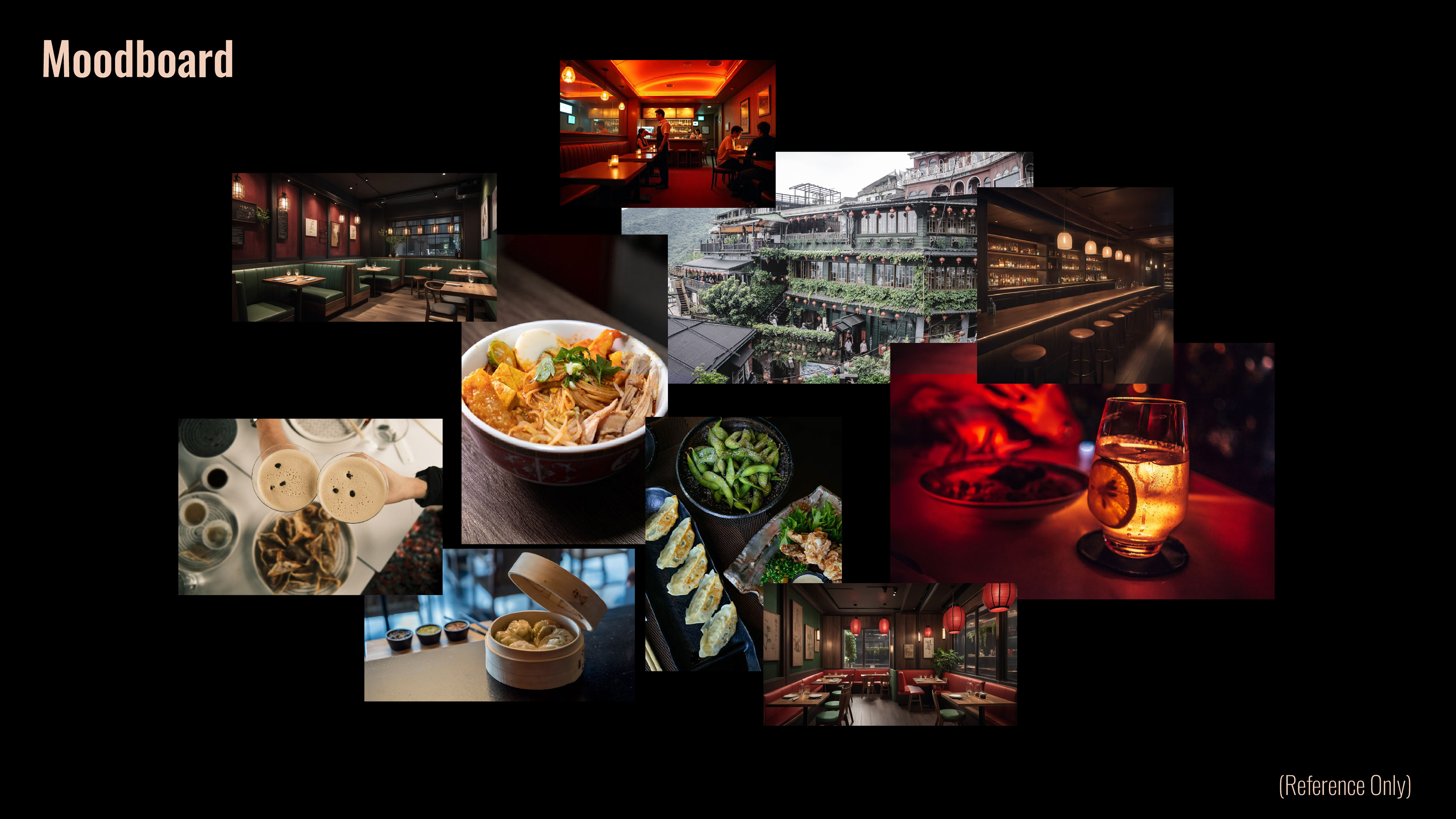
"Ja Ba" is a Taiwanese-American fusion restaurant that celebrates the rich cultural heritage of Taiwan while blending it seamlessly with modern American dining influences.
"Ja Ba" is a Taiwanese-American fusion restaurant that celebrates the rich cultural heritage of Taiwan while blending it seamlessly with modern American dining influences.
The name "Ja Ba" originates from the Taiwanese Hokkien phrase meaning "I'm full," embodying warmth, hospitality, and a joyful dining experience. The brand seeks to redefine perceptions of Taiwanese cuisine, offering a creative, elevated experience for food enthusiasts.
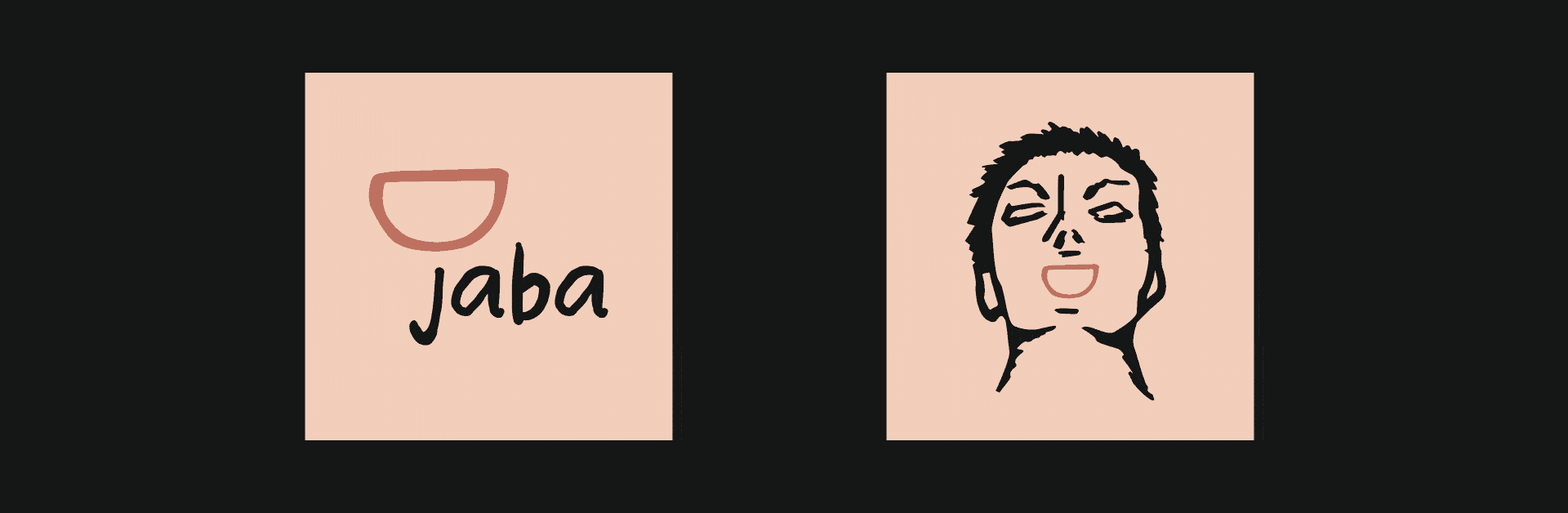
Visual Identity
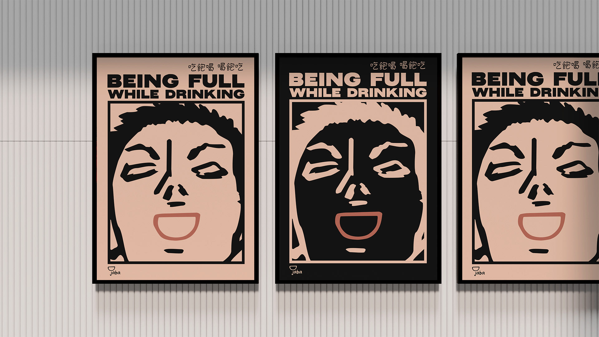
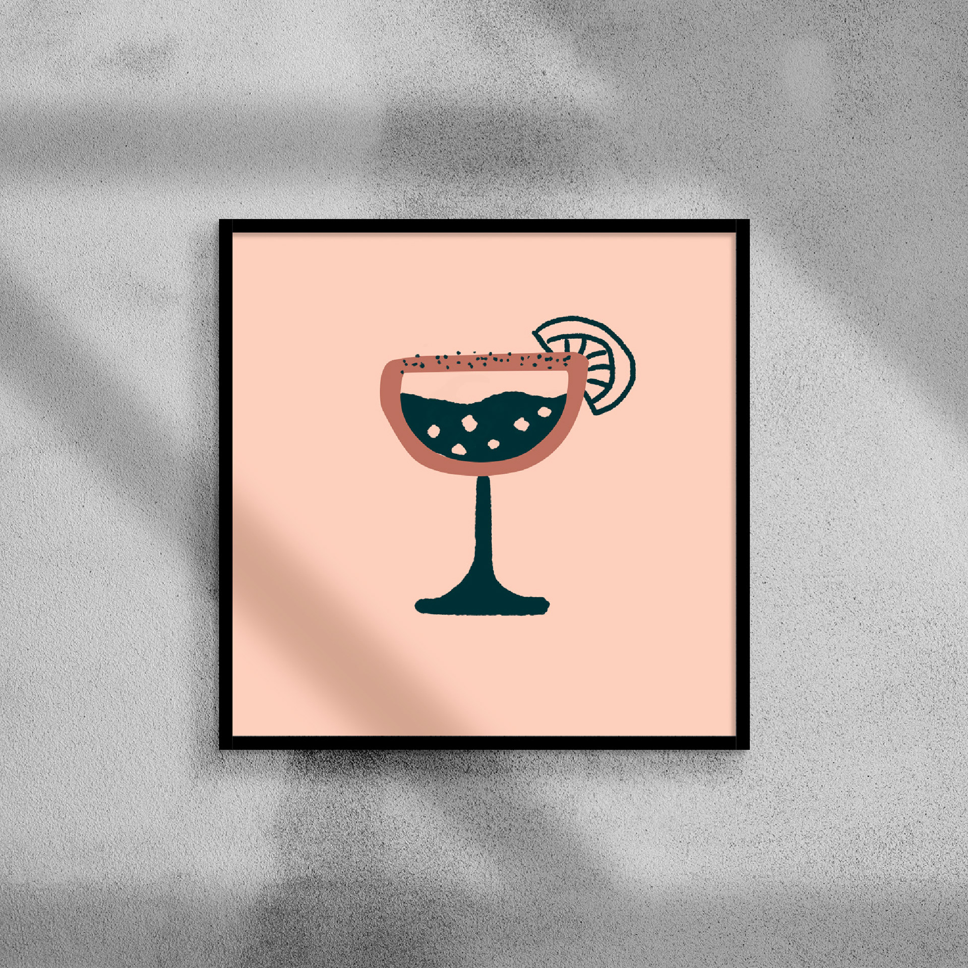
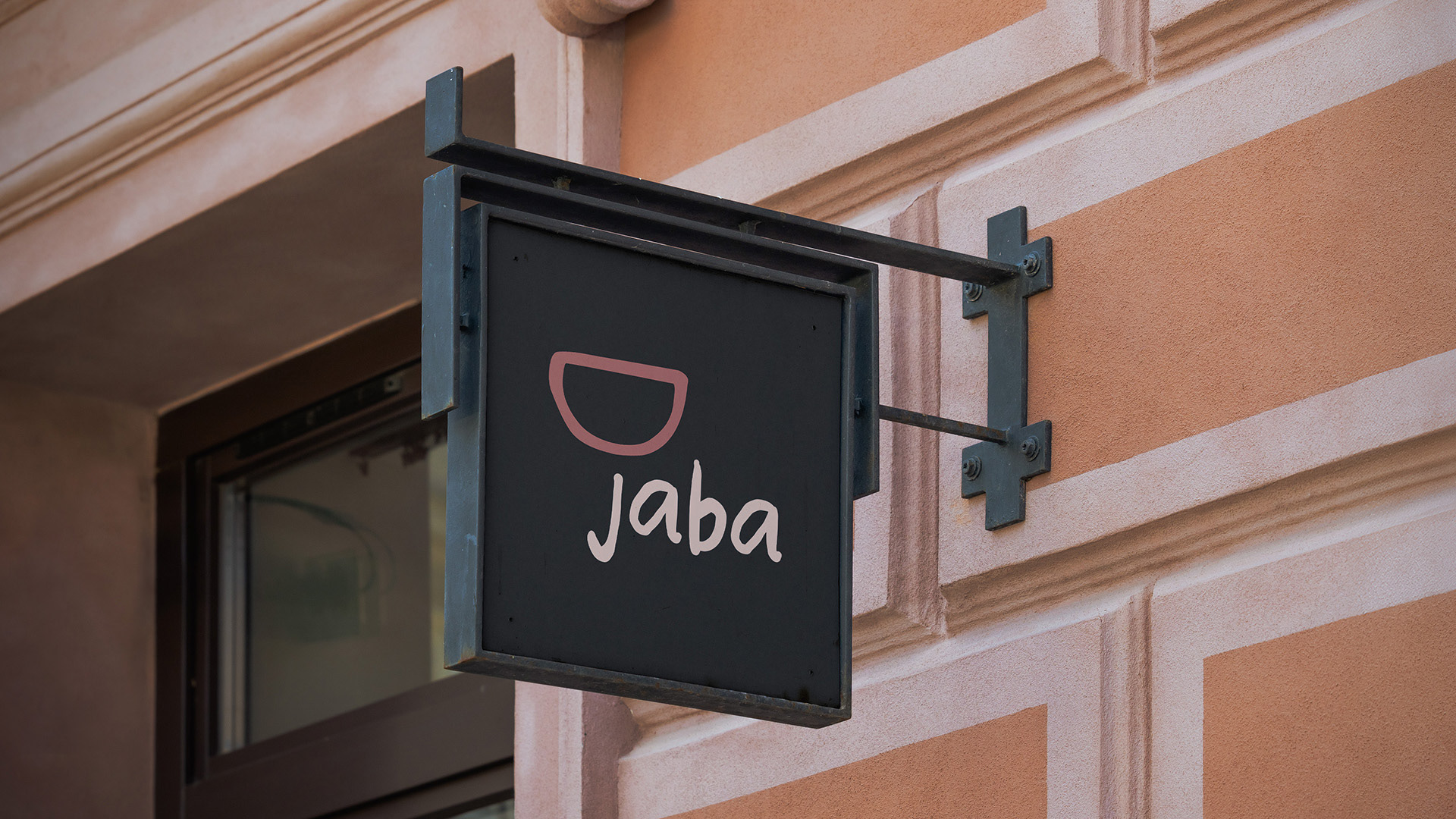
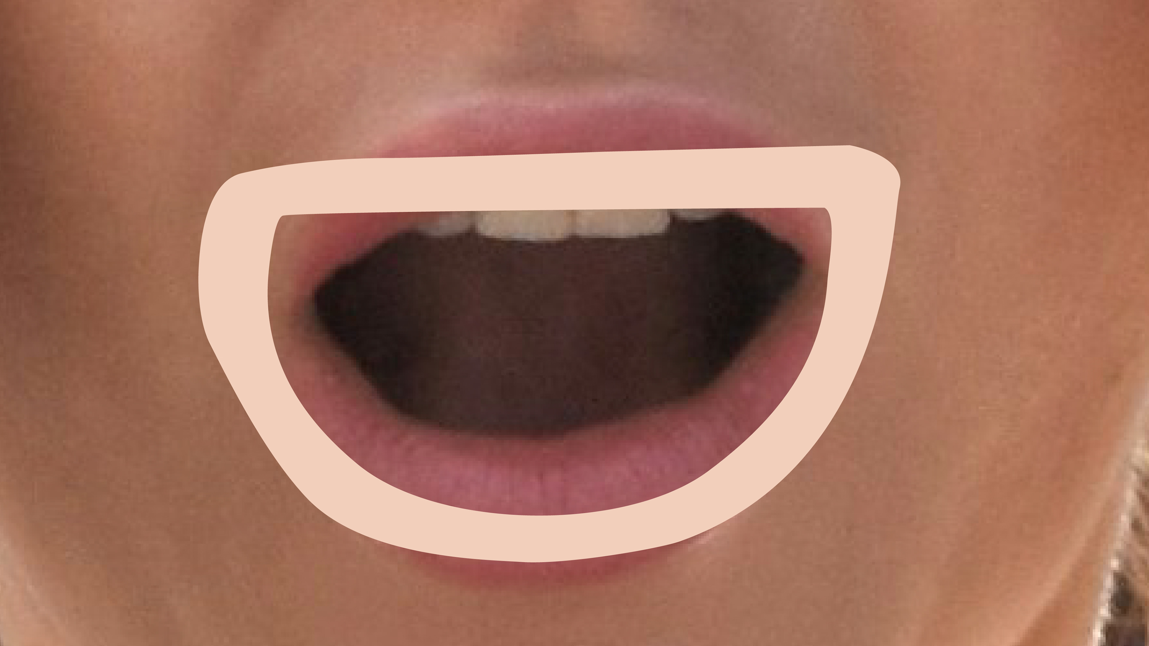
The Ja Ba logo is a clever fusion of shapes—it’s a mouth enjoying great food, a wine cup toasting to good times, and when flipped, a stomach feeling full and satisfied.
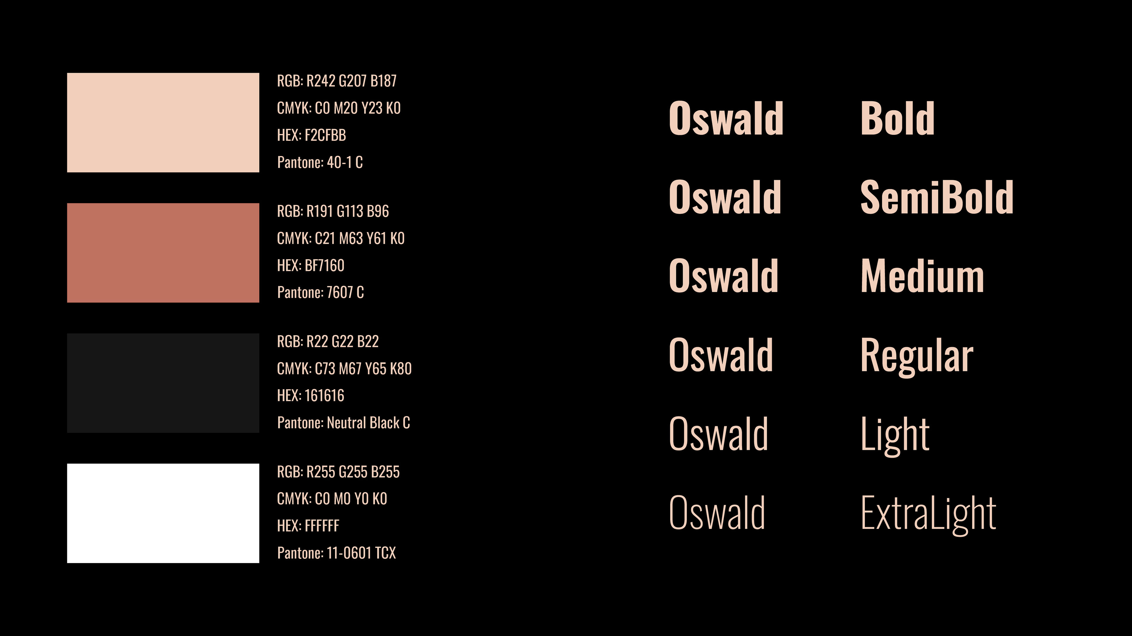
The warm grey color reflects natural skin tones and the cozy glow of a lively bar, making Ja Ba feel inviting, fun, and effortlessly cool—just like its food.